Working on a horror book cover is pretty challenging. It’s more than just slapping an image of something creepy on it or simply using a dark-colored font. It’s setting a tone, creating suspense, and inviting people into a world of fear before they ever read a word. But what makes a good horror book cover? Let’s take a closer look at what would make a cover truly spine-chilling.
Setting The Tone With Imagery
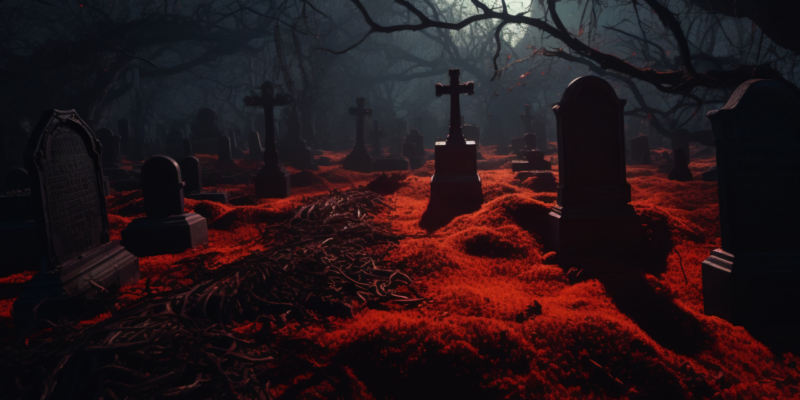
It’s the imagery, of course, by the very first glimpse of the horror book that attracts people and suspends them in suspense. A haunting face, a shadowy figure, an abandoned house, instant fear and unease. It is as if you just stepped into a dimly lit room-you don’t know what lurks in the darkness, but you have that feeling of tension. This sense of fear needs to be captured visually on the cover. And a horror novel cover should evoke the same amount of unease when glanced at. It should express danger, unknowns, and the supernatural without giving it all away.
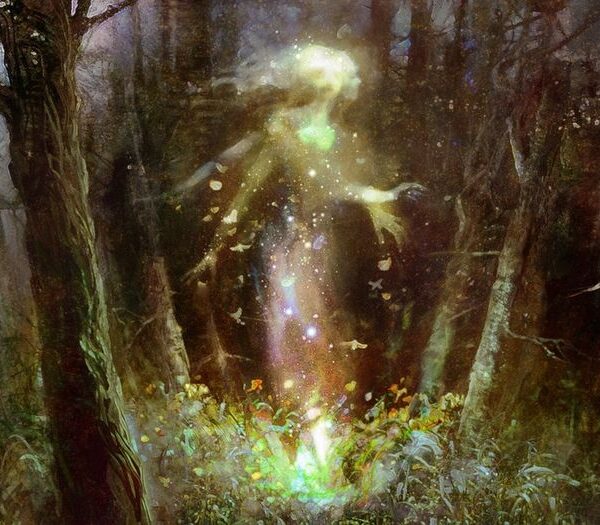
The trick is to create a picture that raises the interest but leaves the reader slightly uneasy. Something moving out of the corner of their eye, or a monster only partially visible, is more effective than something grossly detailed or obviously shocking and repulsive. There’s subtlety in leaving much to the imagination – just like the best horror stories do.
Choosing The Right Color Palette
Colors contribute a great deal toward creating a mood. Think of the best horror book covers and dark, moody colors like blacks, deep reds, and shadowy grays. The colors keep you in that state of fear and tension-the very reason you’d buy the book to prepare for the terror inside. Now and then, though, contrast can work wonders, too. A splash of white or neon green creates a jarring effect, and it’s even more unsettling.
A good color palette can make or break a horror book cover. It’s like the soundtrack to a scary movie – you may not always notice it, but it’s what makes your heart race faster.
Fonts That Speak Fear
You’re not going to use Comic Sans on the cover of a horror novel, are you? The typography is as influential as the image. Bold, jagged fonts scream horror; tasteful font styles can create mystery and suspense. It all depends on what type of horror your book sells. A slasher novel might want to use a rough, splattered font, while a psychological thriller might want something more sleek and eerie.
The type face should be readable but also say something about the mood of the book. It’ll jump right off the cover with that sense of urgency and the story’s almost moved too.
The Power Of Minimalism
Sometimes, the less is more. You would probably not expect a sparse book cover to be scary when the horror genre is about it, but the fewer the details on the cover, the scarier it is made. One solitary figure standing in an empty field or just a single bloody handprint sends very chill feelings down a reader’s spine without overwhelming them with too many details. Minimalist covers often leave much to the imagination, and as any horror fan knows, what we don’t see is often more frightening than what we do.
It’s minimalist, so it stands out on a crowded bookshelf. Amidst all the over-designed covers, it is striking to see a simple, clean yet unsettling image.
Subtle Hints Of Story
Great horror book covers are not those that scream generic scary things but rather convey a sense of subtlety, suggesting what the story entails. A picture of a ruined mansion speaks of a haunted house story. A single candle whose light breaks through the darkness may mean it is a ghost story. These little things call readers to discover the mystery behind the image.
A good book cover, just like a movie preview, should entice while still saying enough to make the audience excited, without saying too much. It is this balance between giving hints towards a story and leaving the audience in suspense that really makes a book cover compelling.
Striking The Right Balance
What characterizes a great horror book cover is that it needs to hold the perfect mixture of fear, intrigue, and beauty. Yes, beauty! Because although the purpose of horror covers is to scare people, they must also be pretty enough to entice readers to open the cover. Too much gore or grotesque imagery might be off-putting to potential readers, while covers that are too mild don’t convey the horror within.
The trick is to get the right balance. The cover should be disturbingly alluring while promising the horrors that lie within it yet remain something readers want to reach out and pick up.
Conclusion
A good horror cover has to get under your skin. A combination of eerily chosen imagery, the proper color palette, and chilling font can present a visual story that attracts as well as frightens. It should make readers feel like they just stepped into the unknown, where menace is lurking right behind the turn of the page.
So next time you are flipping through the horror section at your local bookstore, take a closer look at those covers. What’s the story they’re telling before you ever even crack open the book?


